Many people hope to use banner ads to increase their traffic. However, this is, of course, not always easy. It takes a lot of effort, investment and ideas to design a web banner ad to attract people to click on it.
You have probably had a chance to see banner ads because they are definitely, everywhere on the internet. In essence, web banner design is focused on creating effective banner ads. By using web banner design, you can definitely attract more potential customers.
Banner ads are also called the golden duo because they are affordable and effective at the same time. Today, this is one of the most popular and productive forms of marketing.
We have made a few tips on what a good banner ad should look like. If you have a problem or are not familiar enough with banner ads, keep reading this article. We believe it will help you.
Contents of Post
1. Banner Size
The most effective banner sizes are, according to research, standard. Google Adsense has singled out the standard banner sizes that are most successful. These include:
- Leaderboard 728 * 90px
- Large rectangle 336 × 280px
- Medium rectangle 300 × 250px
- Half page 300 × 600px
2. Place a Banner Ad
It is crucial to research which websites you need to display your ad. This means that you need to choose the right site that will lead you to potential customers.
There is a possibility of buying a space on the website. This will make your banner hard to miss because it will be close to the main content and above the fold.
3. The Importance of Buttons

Buttons can be very significant in banner ads. It is crucial to use them appropriately.
They can contribute to the clickthrough rate of your ad. If you want to make the buttons effective – place them in contrasting colors on the lower right side.
4. No Exaggeration
Sometimes less is more. Most visitors will probably just glance at the banner ad. That is why it is important not to overdo it. Simplicity can often lead you to more potential customers.
So do not overdo it with the text. Keep the content simple. Also, do not clutter your ad with photos. Remember, you only have a second to attract a customer.
5. Hierarchy
This is the principle that banner ads have three main characteristics: a visible logo, the value of a product or service, and a limited-time offer. Visibility of your logo can help the visitor link the company and the ad message.
With the value of a product or service, you can emphasize high quality or something that sets you apart from the competition. A limited-time offer can attract a potential customer to contact you as soon as possible- to buy a product or start using your services.
6. Defined Framework

If you want an effective banner ad – you need to have a clearly defined framework. Such banner ads have a frame whose graphics are extended to the edges of the box.
We usually put a 1-pixel gray box around the white ads.
7. Simple Text
Text can indeed play a key role in banner ads. It is crucial to be clear, simple, and visible.
A word of advice: do not use extremely thin or small fonts, nor italics. Separate the title and copy of the text and put different sizes.

8. Animations Attract Customers
Static banner ads have become very annoying for most people. Now it has become quite hard to attract the attention of potential buyers.
You can achieve this more easily if you use animations. Take care that they do not completely distract from the ad.
9. How To Stand Out but Also Supplement?
In this aspect, online research may be most important to you. Do not fit the banner ad to the limit.
10. Consistency
Every start can be difficult. It is crucial to be consistent. Make sure the color scheme and brand match because the customer’s ad leads directly to your site.
11. Visualization
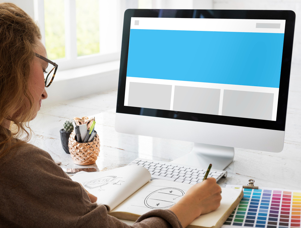
This is an important factor. It would be nice not to overdo it and to put quality content. Graphics, images, and illustrations should be simple and high quality.
12. Visual Urgency
Visual urgency can lead you to more potential customers. Banner ads do not always have to be too simple.
It is all in your idea and sense of aesthetics. Sometimes a combination of colors can highlight your ad and create a sense of urgency.
13. Less Is More
If you put smaller files, then your ad will load faster. This way, a visitor to a page will not be able to move or miss your ad. The recommended file size is below 150kb.
14. File format
It is best to use standard formats such as JPG, GIF, or PNG. Such formats are recommended because flash ads are now quite outdated.
Final words
We have tried to give you some of the most basic tips. If you are not a professional or just starting out, we believe that these tips will be very useful. In essence, in the end, it all comes down to ideas and effort.
The advice is to stick to some basic rules. If you follow these guidelines, we believe that you will design banner ads that will lead you to a large number of potential customers. Read five of the best tools to convert your online audience to new customers to discover how to increase the number of customers.
Using banner ads is also very popular. With your unique idea, you will stand out from the crowd. Good luck!

