When you’re creating an event page, your banner image is the first thing attendees notice. It sets the tone, communicates your brand, and can either capture attention instantly or cause visitors to scroll past without a second thought. Getting the size and design right isn’t just a technical detail—it’s a key part of your event marketing strategy.
TLDR: The recommended Eventbrite banner size is 2160 x 1080 pixels with a 2:1 aspect ratio. Keep important text and visuals centered to avoid cropping across devices. Use high-quality images, minimal text, and strong contrast to make your banner stand out. Always preview your design on desktop and mobile before publishing.
Contents of Post
Why Your Eventbrite Banner Size Matters
Your Eventbrite banner acts like a digital billboard. A poorly sized or low-resolution image can look stretched, blurry, or awkwardly cropped. This reduces trust and can hurt ticket sales. On the other hand, a properly sized and thoughtfully designed banner can:
- Strengthen your brand identity
- Increase engagement and click-through rates
- Improve perceived professionalism
- Boost ticket conversions
Because Eventbrite displays banners differently depending on the device, following recommended dimensions ensures your design looks polished everywhere.
Recommended Eventbrite Banner Dimensions
The standard and most recommended size for an Eventbrite banner is:
- 2160 x 1080 pixels
- 2:1 aspect ratio
This size works well across desktop and mobile layouts. Eventbrite may crop the edges slightly depending on the placement, so keeping essential elements centered is crucial.
Key Technical Specifications
- Aspect Ratio: 2:1
- Recommended Size: 2160 x 1080 pixels
- Minimum Width: 600 pixels
- File Format: JPG or PNG
- Maximum File Size: Typically under 10 MB
While you can upload smaller images, using the recommended size ensures clarity and flexibility across layouts.
Image not found in postmetaHow Eventbrite Banners Display on Different Devices
It’s important to understand that your banner will not look identical on all screens. Eventbrite adapts layouts depending on browser width and device type.
Desktop Display
On desktop, the full 2:1 banner is generally visible. However, wide monitors may slightly crop the top and bottom margins.
Mobile Display
On mobile devices, the image may be cropped more aggressively on the sides. This is why central alignment of text and key visuals is essential.
Pro Tip: Keep all critical information (event name, date, logo) within the center 1200 x 600 pixel area to ensure visibility across devices.
Safe Zone: Protecting Your Important Content
Think of your banner as having a “safe zone” in the center. Placing crucial elements too close to the edges increases the risk of them being cut off.
Design Safe Zone Guidelines:
- Center your event title horizontally and vertically.
- Avoid placing logos near the far left or right edges.
- Leave breathing room around text.
- Test previews before publishing your page.
This small adjustment can make a huge difference in how professional your event page appears.
Design Tips for a High-Converting Eventbrite Banner
Now that you know the technical requirements, let’s look at what makes an Eventbrite banner visually compelling.
1. Use High-Quality Images
Blurry or pixelated images instantly reduce credibility. Use photos that are:
- At least 2160 pixels wide
- Professionally shot or high-resolution stock images
- Bright and well-lit
If you’re promoting a live concert, use an energetic crowd shot. Hosting a business seminar? Choose a clean, professional scene that reflects your audience.
2. Keep Text Minimal
Your Eventbrite page already includes event details below the banner. The banner’s job is to attract attention—not overload viewers with information.
Stick to:
- Event name
- Short tagline (optional)
- Date (if important for branding)
Avoid cluttering the banner with location details, pricing, or long descriptions.
3. Choose Strong Contrast
If your background is dark, use light-colored text. If it’s bright, opt for darker fonts. Poor contrast makes your banner unreadable—especially on small screens.
4. Use Typography Strategically
Fonts set the mood of your event. For example:
- Sans-serif fonts: Modern, clean, corporate
- Serif fonts: Elegant, formal, traditional
- Display fonts: Creative, energetic, entertainment-focused
Limit yourself to two fonts maximum to maintain visual harmony.
5. Align with Your Brand
Your banner should visually match your:
- Website
- Social media graphics
- Email marketing materials
- Printed posters
Consistency builds recognition and trust. If someone sees your ad on Instagram and then lands on your Eventbrite page, they should instantly recognize it as the same event.
Common Mistakes to Avoid
Even experienced organizers make design errors. Here are some of the most common ones:
- Using the wrong aspect ratio (which leads to stretching)
- Placing text too close to edges
- Uploading low-resolution images
- Overcrowding the banner with information
- Ignoring mobile previews
A banner that looks perfect in your design software may appear very different once uploaded. Always check before publishing.
Step-by-Step: Creating the Perfect Eventbrite Banner
Here’s a simple workflow you can follow:
- Create a canvas sized 2160 x 1080 pixels.
- Set guides to mark the central safe zone.
- Add your background image and adjust brightness if needed.
- Place event title in the center with high contrast.
- Add logo or tagline beneath or above the title.
- Export as JPG or PNG under 10 MB.
- Upload and preview on desktop and mobile.
This structured approach reduces errors and improves final output quality.
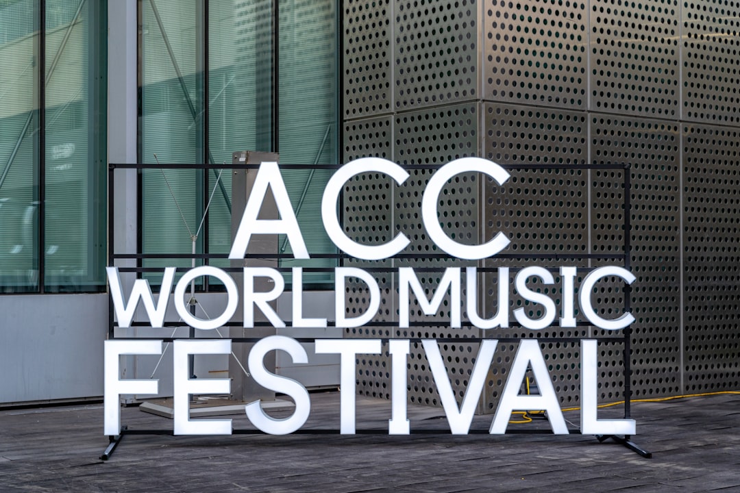
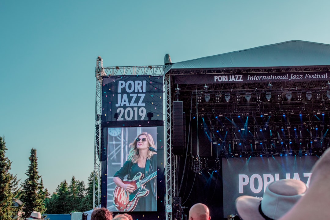
Examples of Effective Event Banner Styles
Different events require different visual approaches. Here are a few banner style ideas:
Corporate Conference
- Clean gradient background
- Minimal text
- Professional headshots of speakers
Music Festival
- High-energy crowd image
- Bold, large typography
- Vibrant colors with strong contrast
Workshop or Webinar
- Simple, uncluttered layout
- Instructor image
- Clear and easy-to-read event name
Optimizing for Better Ticket Sales
Your banner isn’t just decoration—it influences conversions. Here’s how to optimize it:
- Create urgency: Include wording like “Annual,” “Limited Seats,” or “One Night Only” if appropriate.
- Use emotional imagery: Show excitement, connection, or transformation.
- Reflect the experience: Help viewers imagine attending.
Psychologically, people make quick judgments. A strong visual can trigger curiosity and encourage them to scroll for more details.
Final Thoughts
Your Eventbrite banner size and design play a bigger role than most organizers realize. Following the recommended 2160 x 1080 pixel, 2:1 aspect ratio guideline ensures your image displays correctly across devices. Combining proper dimensions with high-quality visuals, centered content, and strong typography transforms your banner into a powerful marketing tool.
Take the time to design thoughtfully, preview carefully, and align your banner with your overall branding. When done right, your Eventbrite header won’t just look good—it will actively help fill seats and drive enthusiasm for your event.