
It’s no longer enough to simply display text and information on a web page – today’s websites need to offer much more. Internet users expect your website to engage them with fantastic web design elements, high-quality content, and clear navigation – also, they need to ensure mobile compatibility.
This post will discuss ten aspects of a user-friendly website and how you can incorporate them in the design process to achieve online success.
Contents of Post
1. Great Website Loading Speed

If your website takes too long to load, it causes a poor user experience, lowering your conversion rates and making you lose business. According to research conducted by Portent, a good page load time is between 0-4 seconds.
Considering the fast-paced world we live in, it is easy to understand why website speed matters so much. When your website contains many media files, such as high-quality videos and images, the pages will likely take longer to load.
This can make users and potential customers more inclined to go to a different website than wait for your content to appear. Solve this issue by resizing, compressing, or even changing the format of the site’s pictures, video, or audio files.
2. User-Friendly Domain Name

As a domain name is what people will type into their browser’s address bar to access your website, ensure to keep it unique yet simple. Consider your domain name as your primary online representation – it will appear on every piece of marketing you create.
When creating your domain name, try not to use hyphens or complex terms. Using a free tool like a domain name generator is an excellent idea to help you pick a user-friendly domain name and avoid a bad user experience.
3. Responsive Website Design
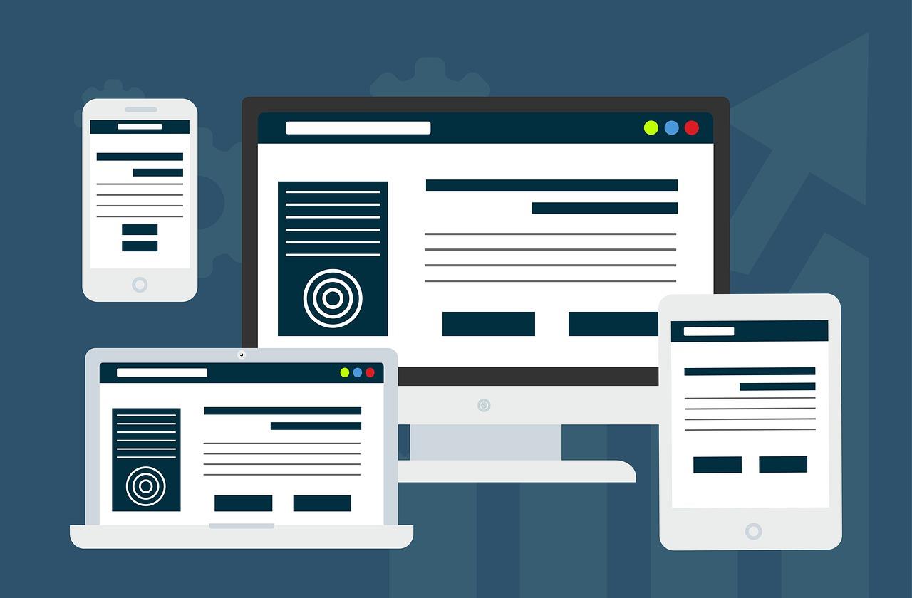
If your site does not have a mobile version, then you’re missing out on the opportunity to make it accessible to billions of smartphone users worldwide. Having a responsive website design that operates effectively and provides good usability across a variety of screen sizes and browsers is critical for any business.
Perform a website usability test to see if your site provides a seamless user experience for all mobile users. Google offers an excellent mobile-friendly test tool that identifies issues and provides recommendations to make your website user-friendly.
4. Clear Page Navigation
Desktop or mobile users tend to spend more time exploring your website if it is easy to find what they are looking for, which helps prevent a high bounce rate. Hence, a user-friendly website should have a main menu with concise and well-organized categories.
For example, Alfa Charlie‘s homepage serves as an introduction to the agency – with the hamburger menu (the three horizontal lines) prominently shown on the top right. Once users click on the icon, it expands to fill the entire screen, clearly outlining the agency’s scope of work. The navigation structure is very simple yet done elegantly.

Use a tool like Google Analytics to assess how well your website’s navigation performs. With the navigation summary report, you can select a specific page to analyze how your website visitors arrive at that page and where they navigate to next.
Check which links are being clicked on and which are not. This information will help you optimize your navigation. If something does not generate any clicks, try to replace or eliminate it. If you decide to make adjustments to the page, use Google Analytics again after a few weeks or so to evaluate the results.
5. Consistent Layout
Consistency is one of the aspects that contribute to effective web design. When it comes to a website’s structure, the layout defines how the text, navigation, graphics, and other vital aspects are organized.
Visitors will spend less time trying to navigate the website and more time engaging with your content if common elements are placed on the same spot on every website page. As an example, despite the distinct visual styles of each BBC category, the main site elements remain consistent.


Same fonts, consistent writing style, and color scheme can also create a sense of harmony within your website. In addition, a consistent design makes it easier for visitors to recognize how items appear on the pages. This particularly improves the usability for visitors that use screen readers.
6. Clear Calls-to-Action

CTA buttons can have different sizes, shapes, or designs and be placed anywhere – on a specific landing page or at the end of an article. The main objective of CTAs is to draw the user’s attention and, ultimately, compel them to complete the desired action.
In addition, CTAs should instill a sense of urgency. Thus, when customers see them, they get the feeling of passing up a great opportunity if they don’t follow it.
Use action-oriented text such as “Read More,” “Get Offer,” or “Contact Us” to generate engagement. Along with keeping it clear and simple, make your CTAs large enough to read without cluttering the site.
7. Easy-to-Read Content
Apart from writing valuable content, easily digestible articles can increase the attention span of your audience. To keep their focus, try to divide your blog posts into short paragraphs. Moreover, use headings to provide a preview of what the reader is about to read. This allows visitors to move to the parts of the article that they want to read immediately.
In addition, make your content more readable by using a table of contents. A ToC allows users to see the structure of your content so they can tell whether you’re going to address their concerns and make them interested in continuing scrolling.
8. Simple Forms
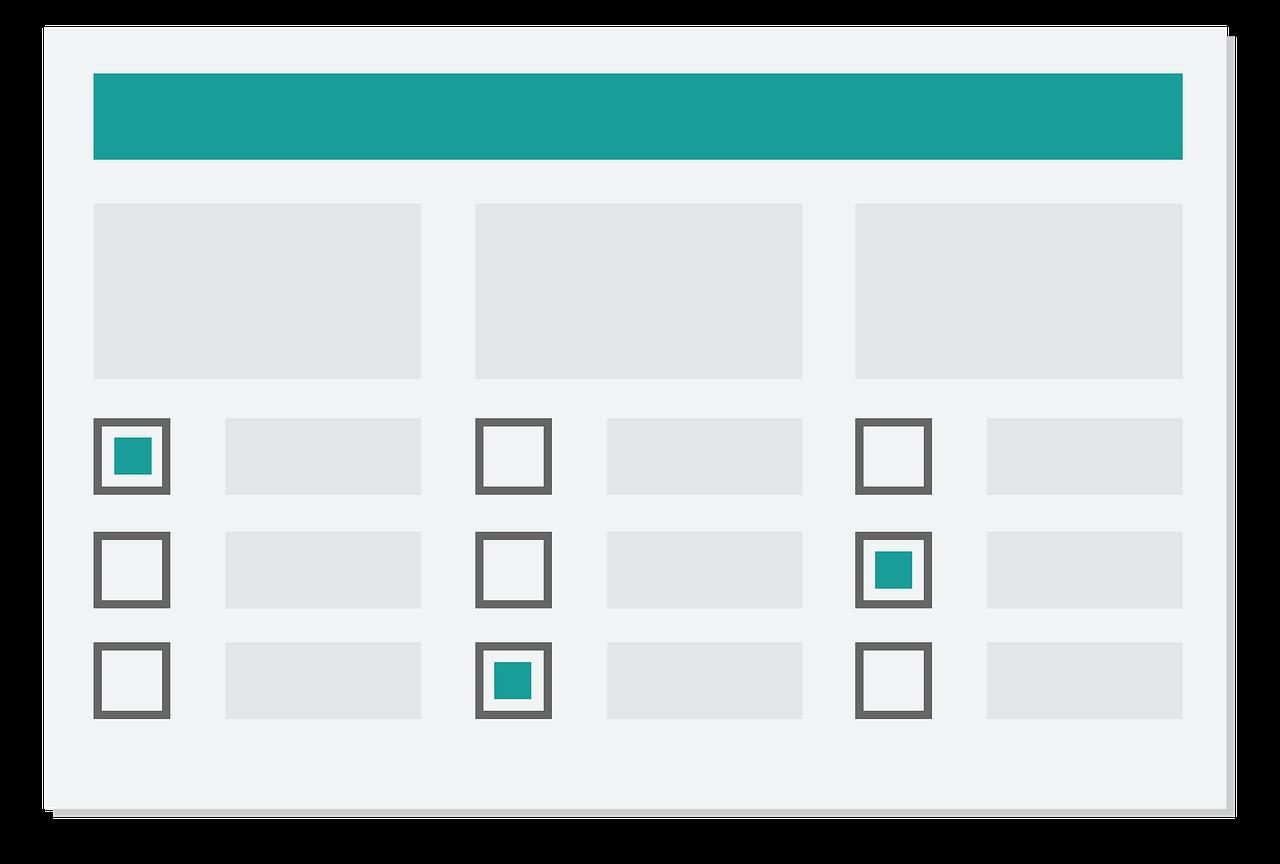
Forms should be well-organized and clear. You don’t want a user to spend a lot of time thinking about the meaning of each question listed on the form. This can lead them to abandon your website before they’ve even tried to fill it out.
Therefore, create straightforward and understandable questions – leaving no doubt about what and why you are requesting it.
9. Accessible Search Function
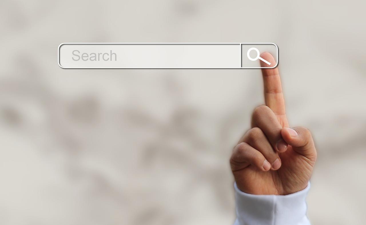
Placing a search bar on a large-scale website enables users to swiftly locate what they’re looking for. The search function is particularly crucial for eCommerce sites or other websites with many category pages, as clicking around may be very time-consuming and frustrating for site users. Hence, ensure to display a search bar prominently on the site pages.
10. Enough White Space
Whitespace is the empty area between elements on your web page, such as images, typography, and icons. Whitespace also provides easier website navigation for interactive content like quizzes.
Also, it helps direct the user’s attention to specific focal points on the page layout. Not only does whitespace enhance your website usability, but also its aesthetic appeal.
Conclusion
These ten indicators apply to all types of sites. Just ensure to make improvements consistently. When it comes to website usability, a good practice is to ask your customers what they want you to add, remove, or replace on your site.
However, if your site isn’t generating leads or not doing as well as expected, it’s time to evaluate the overall look and feel of your website. Make changes based on the user-friendly characteristics outlined above, such as improving page speed and ensuring your website works well on mobile phones.
It’s important to keep in mind that no matter who your target audience is or what industry you’re in, a user-friendly website is a must for your business. It will help keep users engaged and improve your conversion rates.